
Once upon a time, only people who knew tech stuff made tiny websites. Knowing code like HTML, CSS, and JavaScript was necessary – also how to handle web hosts, domains, because design rules mattered too. A basic single page site might need days, sometimes weeks before going live after testing. Newcomers without programming skills found it tough; confusion built up fast. Many gave up completely on having their own online spot for work or self.
Now things look totally different because no-code site creators showed up. Anyone can build a working website fast – no tech skills needed at all. Instead of coding, people use visual blocks they move around with a mouse. Ready-made designs help skip starting from nothing every time. Functions like contact forms or taking payments come already built in. Even small projects get online without spending much money. People who run events, make art, or start businesses find this especially useful. Getting seen on the web now takes just one afternoon instead of weeks.
A tiny online site works well when getting things done fast matters most. Not like regular sites full of menus, links, and features cluttering the view – this one keeps it short. Usually just one screen appears – or maybe two linked together – no more. The aim stays sharp: say something straight or finish one task cleanly
Start by showing what your product does on a clear web page. Instead of listing everything, let people see how it fits their needs. Show prices openly so there are no surprises later. Guide them gently toward signing up or buying without pushing too hard.
A single page holds everything needed for the event. Details like date, location appear upfront – clear without clutter. Tickets show pricing tiers alongside availability updates. Signing up feels straightforward because forms sit near entry points. Info flows step by step but never drags on. Each section links naturally so visitors stay oriented. Space stays open; nothing crowds the eye. People find what matters fast – no hunting through blocks of text.
Picture your best projects up front – let results speak through clean design, real feedback tucked beside each win. A smooth path guides visitors past every milestone you’ve hit. Testimonials sit close to outcomes they support. Layout bends to clarity, never clutter. Each piece earns its place by being seen.
A single purpose gives these small sites their strength – speedy setup comes next, then simple upkeep follows close behind. Because they center on what users actually do, clutter stays out. Trying something new? A trial run fits neatly into place long before big decisions arrive.
A fresh start begins here – learning to build a tiny website without confusion. One moment you’re staring at blank options, next you’re picking tools that fit your needs. Picking where to host comes before browsing layouts that match your goal. Templates give shape, yet changes make it yours. Think small screen first, since most visitors use phones. Details matter more than speed when clarity drives design. No coding past needed, just clear moves one after another. Finish ready, not rushed, knowing each part works together.
Understanding Micro Websites
A tiny site packs just enough pages – maybe one, maybe five – to get straight to the point. Not like big websites cluttered with menus, subpages, corners you never visit. Built that way on purpose: clean lines, no detours. The goal? Say something clear. Push one move. Shine light on a single offer, idea, or push. Fewer parts mean less noise, more focus.
One big plus about a micro site? It cuts through clutter. With just a few pages, attention stays sharp. What matters stands out fast because extra details fade away. Fewer choices mean faster decisions for anyone looking around. These sites shine when the goal is clear and narrow. Picture someone landing – no guessing needed. Purpose shows up right away, thanks to tight structure. Distractions dissolve into the background quietly. They work well when only key facts matter most. Simple layout, less noise, quicker grasp – each part pulls weight
Start by showing what makes it different. Price details appear next to each option. Clicking leads somewhere useful happens after that.
When sharing an event, put every detail together – date, spot, timing, sign-up sheets – all visible at once. One clear view helps people find what they need without hunting around. Stuff like when it happens, where to go, what time things start shows up right there. Forms needed to join? They sit alongside everything else. No splitting pieces across pages. Seeing it all together makes sense of the plan fast.
Get people to join your list by offering useful downloads, demo requests, or updates through short forms placed where they flow naturally into the experience. Forms show up at just the right moment, guiding visitors without getting in the way. Signing up feels like a next step, not a leap. Each form fits the page it lives on, matching how people already move through the site. The goal is smooth entry, not pressure. Interest turns into action because the path stays clear.
A glimpse into what you’ve done can speak louder than words. Your projects take center stage when laid out simply. Skills stand out best when they’re not buried in clutter. Achievements shine when given room to breathe. A clean view keeps attention right where it belongs – on you.
One big plus about tiny sites? They come together fast. Since they cover less ground, building one takes way less time – sometimes just hours, maybe a day or two instead of weeks. Less code work needed. Fewer drawn-out steps. No tangled design phases slowing things down. Companies and people save money this way. Ideas go live quicker too. Testing something new becomes simple, almost immediate.
Most small websites work well on phones. A clean layout means anyone can move around easily, no matter what gadget they use – especially handy now that so many browse on screens in their hands. Updates tend to go smoothly too; fixing things or adding new bits does not demand a tech expert nearby.
A small website works well when you need to share one clear message online. It helps people or companies reach a single aim fast. Building it takes less effort than making a full site. Focus stays sharp because there are fewer parts involved. This kind of setup skips the usual headaches. Getting started does not demand deep tech skills.
The Advantages of No-Code Website Builders
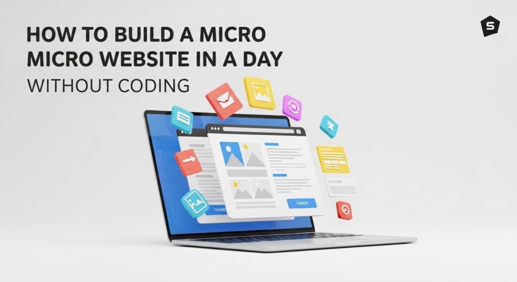
Ever thought about making a site in just one day? Skip the coding entirely. The solution shows up in tools that skip code completely. Anyone can craft clean sites fast, even with zero tech skills. Look at Wix, Squarespace, Carrd, Webflow – each turns building into something visual. Move pieces around like puzzle parts instead of typing commands. Design happens by pulling blocks where they fit best. No need to memorize languages like HTML or JavaScript. Ideas go live without touching syntax. Simple actions replace complex scripts. What once took weeks now clicks together in hours. Building stays open to everyone. Experience matters less than vision here. Tools shape themselves to thoughts, not the other way. A few taps beat endless lines on a screen.
Starting fresh? These tools welcome newcomers, yet still pack strength for pros aiming to tweak extras. Pick a layout first – then shape it using words, pictures, logos. Publishing comes last. Not one bit of coding needed at any step.
Some of the key advantages of using no-code website builders include:
Ready-made layouts sit waiting, built to launch right away
Starting fast doesn’t mean skipping style – many tools include ready-made designs built for fields like retail, art shows, or pop-up events. A starting layout pops up right away, yet shifts easily to fit your look, down to the shade of blue you prefer.
Mobile-responsive layouts
Besides drawing most web visits today, phones demand layouts that adapt without fuss. Because screens come in wildly different shapes now, tools made for non-coders reshape content on the fly – keeping things smooth whether someone uses a tablet, phone, or computer.
Built-in hosting and domain management
Getting a website live the old way means sorting out server space, linking a web address, then adjusting settings – tough stuff if you are just starting. No-code tools take care of all that behind the scenes, usually bundling in things like domain buying, security files, plus where it lives online. All setup happens quietly, leaving you with a working site that people can reach safely from anywhere.
Seamless integration with essential tools
Some no-code tools include ready-made parts or shops where you can pull in contact forms, email updates, payment options, social posts, plus tracking tools. With these, watching how visitors move through pages, catching new leads, or replying to users happens right on the site – no extra code needed.
Put simply, anyone can build a working, good-looking site within hours using no-code tools – zero tech skills needed. These platforms let small business owners, artists, and startup founders bring concepts live fast, skip coding headaches, while staying sharp on what matters most. A few clicks replace months of back-end struggles, turning time into progress instead.
Step-by-Step Guide to Building a Micro Website
1.Define Your Goals
What exactly should this tiny site achieve? Picture that first. Without knowing why it exists, every choice gets shaky – colors, words, buttons, everything drifts. Start by getting solid on the reason behind building it at all. That one idea shapes how visitors feel when they land. Think about who will see it, what they need right away. Let those thoughts steer each section. Clarity up front saves time later down the road
Figure out what folks should actually do once they land here.
What’s the plan – pushing a product, gathering emails, highlighting an event, or displaying work? The purpose shapes how the website feels and flows. Each choice bends layout and words in different directions.
Who is my target audience?
A visitor’s expectations set the pace for how a small site feels. Picture a designer showing work to new customers – clean lines, quiet colors, everything in place. But imagine a concert coming up; bright images move the eye, sound seems ready to burst through the screen.
What key information should the site include?
Start by thinking about what visitors must see on your site. Usually, small websites need just a few key parts – like one page that shows what you do, another where people can reach out, maybe a space to highlight work or services. Some include brief background info, others skip it. The exact mix depends on purpose. Focus shifts based on goals, audience, even industry. Often, simplicity wins
Right off the bat, this first screen shows what you’re about while pulling people in. It grabs interest without fuss, laying things out simply. A strong next step stands out, guiding visitors naturally forward. Purpose meets clarity here, right where it matters most.
Built on real moments, this space shows where things began. A journey unfolds here, one moment at a time. Through shifts and pauses, the path stays clear. What started small now speaks louder. Each step forward adds weight without noise. Roots matter more than speed. This is not about fast growth – just honest steps. Who stands here shaped what came next. Moments stack into meaning.
Get in touch or join up – offers folks a path to connect, maybe by sending a message through a form or signing up for updates. Reaching out becomes simple when options are right there, like dropping info into fields or hitting yes on emails now and then. A chance to respond shows up whenever someone decides to act instead of wait.
Product/Service page: Highlights features, pricing, and benefits if you’re selling something.
Besides testimonials, maybe show a gallery if that fits what you’re aiming for. Sometimes event specifics work better than reviews. It really hinges on the purpose behind the page. Photos can speak louder than customer quotes now and then.
My goal – what am I actually aiming for?
Start by picturing what happens when someone visits. Maybe they sign up, buy something, or ask a question. That image shapes how you build your next-step prompts. Clear vision leads to better direction.
Start by laying out clear aims before doing anything else – it shapes how fast things move later. Each part of your small site ends up having a reason, thanks to early thinking. Without it, pages drift into clutter pretty quick. A little groundwork changes confusion into something straightforward. Suddenly, finishing everything in one day feels possible.
2. Select a No-Code Platform
Select Platform According to Needs
After setting clear goals for your micro site, picking a suitable builder comes into view. That choice shapes how smoothly things go during setup, along with the end result. One tool might shine for portfolios, another for landing pages – fit matters. Take time to weigh what each option handles best before moving forward
Carrd – Best for One-Page Sites and Micro Websites
Built only for quick setup and ease, Carrd skips clutter. Perfect when you need one page that speaks fast instead of shouting. Templates come bare but smart – ready for phones right away while still letting you tweak colors or fonts. When getting online matters more than having every tool, it stands out quietly. Speed wins here, nothing else gets in the way.
Wix – Flexible and Beginner-Friendly
One thing about Wix – it works well for small businesses, personal sites, or creative portfolios. Place items freely across pages thanks to an intuitive drag-and-drop system. Templates plus add-on apps give extra power without needing code knowledge. Need more space than a basic site offers? This platform handles growth smoothly. Interactive tools like image displays, appointment schedulers, or shopping areas fit right in. Experimentation feels natural here, especially when testing dynamic content layouts.
Squarespace – Professional and Visually Appealing
Beautiful designs come standard with Squarespace, thanks to templates crafted with care. For creatives needing an online home fast, this platform delivers sharp visuals without effort. Blogs appear effortlessly; stores take shape smoothly – tools exist where you need them. Style matters here, yet practicality stays close behind every layout option. Insights track visits quietly, working beneath the surface of each page.
Webflow – Advanced Design Without Coding
Creative folks looking to shape designs and motion without touching code often turn to Webflow. Though trickier to learn than Wix or Carrd, it opens doors to detailed, lively sites built their way. When a small site needs unusual structure, tailored actions, or bold visuals – yet stays no-code – this tool fits well. With time spent learning, fine control becomes possible behind the scenes.
Why using a user-friendly website builder matters:
Picking a solid no-code tool might shave whole days off your schedule. Most of these platforms take care of where your site lives online, how it looks on phones, and linking up with other apps – no manual fixes needed. With those pieces running quietly in the background, attention shifts naturally to shaping the story, arranging visuals that click, then steering people where they need to go instead of wrestling error messages or configuration screens.
3. Customize Your Template
Customize the template using your content
Start by picking a layout through the service you picked, then swap out the sample bits with your words, photos, or videos. Since templates only handle how things look, it’s your material that shapes the character of the small site, shares what matters, pulls people in. When done right, adjusting each part makes the result feel sharp and focused on your purpose, regardless of skill level.
Here’s how to approach this step effectively:
Swap out sample words with your actual message. When you write titles and smaller lines underneath, keep them sharp enough that anyone gets the point right away. Say you are sharing a gathering; the big line up front has to explain what it is about, quickly. Visitors need to understand without stopping to think. Clarity comes first every single time. What you mean must land fast, not hide behind guesses. A strong start pulls people in before they scroll further down.
Short sentences work better. Still, clarity matters most of all. Chunks of text? Split them up. That way, eyes move faster across the page. Every word must pull its weight. Even so, skip terms that confuse people. Experts might get fancy words. Everyone else just needs plain talk. White space gives breathing room. Besides, dense blocks feel heavy. Say what you mean directly. Yet never overload a single line. Readers decide fast whether to stay. Therefore, make each part count.
Besides good design, think about what words people type when looking online – those matter. Toss in terms real users actually hunt for. That way, search engines can find your tiny site without trouble. Hidden pages get ignored, after all. Words shape who stumbles upon your corner of the web.
A little box where people type their messages shows up here. This way they can get in touch without leaving the page. Questions come through it easily. Some might want details about what you offer. A spot for emails lets them stay updated if they choose. That part collects names and addresses quietly. Each piece works on its own but fits together when needed.
Staying in touch becomes easier when people join your mailing list. That connection opens doors – new ways to interact show up over time.
Forms often come built-in with drag-and-drop editors, so setting them up takes just a few clicks. One field leads into another without needing code at all. These pieces gather responses automatically once someone fills them out online. After submission, data flows straight into linked apps like mailing platforms. Some setups connect right away using preset hooks between services.
A single step is what matters most on each tiny site. Not every link works well if it does not point somewhere real. One choice stands out when the path feels natural. Often, people move faster when they know the next move. A button that says exactly what happens helps them go further. Some paths fail because they leave too many options open. Clarity arrives through simple words on a solid background. Movement grows once the user sees where to click. Each page gains strength by reducing guesses. Purpose shows best when one action leads forward.
Above the fold, situate your call to sign up where eyes land first. Close to important details, position another prompt – this one set apart through bold color. Buttons draw attention better when they contrast sharply with surroundings. Near a headline or just after a feature list works well. Visibility improves if each trigger stands out clearly from nearby elements.
Try phrases such as “Start Today” or “Find Out How” so people know where to go after reading. Beginnings like these point the way without confusion. Jump into using words that show movement instead of sitting still. Phrases with energy tend to land better than flat ones. Go beyond just stating facts – nudge forward. Words like “Begin” or “Explore” open doors more quietly than shouting. Let each line pull someone one step further. Clear steps feel natural when they match the flow. Ending on motion keeps things going.
Pictures work better when they’re sharp and clear. A good photo grabs attention before a single word is read. Because details matter, blurry clips slow things down. Instead of walls of text, try showing what you mean. When visitors see something real, they stay longer. Crisp videos explain fast. Seeing beats reading every time. Stuff looks trustworthy if it looks professional. Even small graphics help break up heavy blocks. Quality matters more than quantity here.
A fresh photo, a custom graphic, or even a short video might highlight your work, people, or offerings. Alternatively, stock visuals could fit – so long as they feel like you. Yet only when they match how you present yourself.
Fine-tuned pictures run quicker online when shrunk without losing quality. A smooth fit on phones and computers comes from smart scaling. Each visual holds clarity whether stretched wide or viewed narrow.
Starting with small tweaks to your template brings clarity and purpose. A few targeted changes shift it from bland to something that feels like yours. With each detail adjusted, visitors connect more easily to what you’re showing. Simple edits lend strength even if you lack technical skills. The look sharpens when choices match intent. Done right, the result stands clear – no extra steps needed.
4. Optimize for Mobile
Optimize For Mobile
Every day now, more people browse online using phones than ever before. A beautiful page on big screens might mean nothing when squeezed onto small ones. Though many tools fix layout issues by themselves, counting only on them is risky business. Glitches pop up where you least expect – tiny buttons, stretched images, slow loading. Fixing those bits one at a time often makes the real difference. Smooth movement between sections? Crisp text without zooming? That comes from checking again and again. Most platforms help, yes – but care matters just as much.
Here’s how to optimize your micro website for mobile:
Start by checking your site on various screens. Look at it through the preview options inside your website editor, so you know how it shows up on phones, larger handhelds, also computer monitors.
Notice how big the words appear, since reading them should feel effortless. Pictures need to sit right without crowding anything else. Clickable parts must show clearly, sized just enough to tap or click with ease. Space between pieces keeps things from feeling cluttered. Everything adjusts properly, no matter the screen.
Screens get smaller, so layouts must shift. What fits wide desks may crowd tiny pockets. Resize pieces when they clash on phones. Move blocks around if they bump into each other. Stacking top to bottom often works better than side by side. Space changes how eyes follow paths.
Avoid crowding when placing columns, menus, or blocks near each other. Readability often rises once design elements take up less space.
Make buttons, links, and forms simple to press when using small devices. Frustration creeps in if taps miss their target due to cramped layouts. Space things out so fingers land where they aim. Tiny targets cause mistakes – give each element room to breathe. Touch areas need size, clarity, separation. Cluttered clusters confuse; clean spacing guides action.
Fingers tapping small screens need working spots to mark, pick, or type – check every box, field, drop-menu fits. Smooth moves matter when shifting between phone tasks.
Start by looking at how images resize on small displays. When screen size drops, visuals need to adjust smoothly – so they stay sharp. Videos must shrink cleanly, never pixelated. Graphics fit neatly, no matter the device width. Quality holds, even when dimensions change. Loading stays quick because files adapt efficiently. Scaling happens behind the scenes, built into layout behavior. Crispness remains high across phones and tablets alike.
Big files slow things down. Try shrinking images instead. That helps phones connect faster when networks are weak. Cutting out heavy extras makes a difference too.
Navigation on mobile works best when it stays simple. A tidy layout helps people move around without confusion. Try using a menu shaped like three lines – it saves space. Or go with a long scroll down the page instead. Both options make finding things quicker. Fewer taps mean less frustration. Getting where you need should feel smooth, not complicated.
Most people browse on phones now, so making your tiny website work well there just makes sense. When pages load fast and look clean on small screens, visitors stick around longer instead of leaving right away. That smooth feel builds trust without saying a word. Scrolling becomes natural, tapping feels easy, everything flows better. Getting found online often starts with how well things run on handheld devices. Filling out forms takes less effort when buttons are big enough. Showing off a new item? People actually see it clearly. Announcing something happening soon? Dates stand out, details stay readable. Each little improvement adds up quietly over time.
5. Connect a Domain
Select And Link Your Domain
Once you finish shaping your tiny online space, picking a web address comes next – this is where people will look for you. A smart pick here might just shape how serious, sharp, or unforgettable your spot feels.
A free subdomain often comes at the beginning – many no-code platforms include one by default. Take Carrd, Wix, or Webflow: they hand out addresses like these right away. Your page could show up under [yourname].carrd.co without extra steps. Sometimes it’s [yourbrand].wixsite.com, just ready to go.
A fresh start comes easily here – no need to pay first. Trying out concepts works well, since setup happens fast. Maybe it’s just a short-term spot online. Building skills feels smooth when there’s no pressure. The process stays light, helping new attempts grow naturally.
Avoiding a polished look is common with free subdomains, particularly when used for services aimed at clients – they often stick out as less memorable. Their address tends to slip minds more easily than something custom.
A smart move? Getting a personalized web address. Try something like yourbrand.com – it makes your small site look put together, trustworthy. One step up from free links, it shows you mean business without saying it out loud.
A name you pick sticks better in people’s minds, spreads more naturally, yet shows up cleaner in searches when someone looks it up. Owning one instead of using a free address makes your presence feel more grounded, somehow more serious too.
A handful of no-code tools let you grab a domain right inside their system. Otherwise, sites such as Namecheap, GoDaddy, or Google Domains sell domains separately. Once bought, link that address to your project online.
Start by heading over to your domain provider. From there, shift into setting up DNS settings so they point right at your site platform. Each service walks you through it – clear steps, no confusion. You follow along, one piece at a time, until it clicks.
Your site shows up at the address you picked once it’s live, making people trust it more – whether they’re just looking around or thinking about working with you.
Start strong with a name that sticks. Go brief – fewer letters help folks remember. Simple words beat confusing ones every time. Spelling should feel natural, not like a puzzle. Aim for clear, skip the clutter.
Start with words anyone can spell without trouble. Skip digits entirely – no counting needed here. Letters alone carry meaning just fine. Simple sounds link together easily when spoken aloud. Hard terms slow things down more than most notice at first. Leave out dashes because they break flow too often. Let each idea stand clear on its own, uncluttered by symbols or tricks. Memory works better without extra pieces to track.
Better when the web address matches your brand – people get what you do right away. A name that points straight to your work clears up confusion fast. Picture someone typing it after hearing about you at a coffee shop. It clicks easier if it lines up with what they already know. Familiarity speeds things along. No guesswork needed when the title fits like a label on a jar.
A solid web address helps people see your tiny site as serious, not just some trial run. Starting out on a free link works fine at first, yet switching to your own name pays off fast. Visitors remember where they’ve been when the URL feels personal. Trust builds quietly when things look put together. Finding the place again becomes natural instead of a hunt. Small change, large effect – clean links leave an impression.
6. Publish and Promote
Once the design work finishes, customization wraps up, mobile adjustments lock in, then domain links – your micro site steps out of shadows. Going live acts like a switch flipping: what was hidden now shows up for everyone on the web. Launching isn’t an endpoint though – it’s more like opening day at a small shop tucked between busy streets. From there, getting noticed demands sharing through channels people already scroll through. Watching how visitors move, where they pause, helps shape quiet tweaks behind the scenes. Visibility grows not by shouting but by showing up consistently where eyes already land. A steady pulse beats louder than one loud bang.
Once you’re ready, hit Publish. Most no-code tools have this option built right in. It sends your pages live online. Your site then appears at the web address you picked.
Right before going live, take a close look – hunt down any spelling mistakes, faulty links, blank image spots, or things that sit crooked. See how it appears at the very end across computer, tablet, phone screens so nothing feels off.
Try showing your small site on social apps. Where people hang out – maybe Facebook, maybe X – post it there. A quick line might help draw attention. Instead of just links, say something that makes folks curious. Even one surprising word can make a difference. LinkedIn could work if that fits who you’re trying to reach. Pictures sometimes pull more eyes than words do. Keep it short but clear enough to matter. Not every platform needs the same version. Tweak each post so it feels natural where it lands. Timing matters too – not always at noon, not always Monday. Someone scrolling fast might pause for the right hint. Just once in a while, test a different angle. It doesn’t take long to see what sticks. What works today may fade next week. Watch quietly, then adjust without fuss.
Start by reaching out through your current contact list. A short message works best when it presents the new site plainly. Include a direct next step so readers know what to do. It tends to work well when people are invited to events. Launching something new also fits this approach. Signing up for updates is another fit. The key is clarity without extra noise.
Picture this – clicking through paid spots on Google or social platforms like Facebook and Instagram sends interested folks straight to your page. A modest amount spent might just connect you fast with the right people looking for what you offer.
A small square of pixels might do more than words when you print it beside your name. Try placing that digital doorway on paper signs so people can peek online without typing anything. Each time someone scans, they step straight into your web space from the real world. Even old school cards get smarter this way – no extra lines needed, just quiet access. That silent link lives where ink meets eye.
Start by adding tracking software. This shows what users do on your pages. Try using something like Google Analytics. Or check if your site platform already includes viewing data. Watch behavior patterns over time. See which parts get attention. Notice where people leave. Use real usage details instead of guessing. Every visit leaves clues. Learn from those signals.
Track metrics like:
- Number of visitors
Visitors clicking through pages might stay longer, though time spent does not always grow alongside page count. Sometimes more screens appear without deeper engagement
Clicks on call-to-action buttons
Form submissions or sign-ups
Over time, seeing how people use your site shapes better choices. What works becomes clear when numbers tell the story. Adjusting ads gets easier once patterns show up. Improvement hides in details most overlook.
A single benefit? Micro sites bend without breaking. Once live, tweak words here, shift a section there – responding to how people actually click through. Try a different prompt at the top if the last one fell flat.
A fresh post now and then makes visitors stick around longer. Pages that change often catch more eyes online. Stale sites fade fast, while updated ones stay sharp in searches.
Your micro website gains ground when shared with purpose, reaching more people the right way. When paired with careful tracking, it does more than appear polished – it delivers what you need, like drawing in interest, filling seats at events, or displaying work clearly. Each step forward ties back to smart visibility.
Best Practices for Building a Micro Website in One Day
A tiny website? It can stay simple. Stick to key ideas so your site feels clear, works well, stays smooth on phones too – no coding skills needed. Try building it like this
Start clean. Simplicity wins most times for small sites. One page tends to do the job well – sharing ideas, showing something new, pulling in interest. Often, that’s all needed.
Too many pages or flashy extras pull attention away. Right off, clarity matters most – users should grasp what you do without guessing. Smooth movement through the site just happens when things stay lean.
Start with a template. Many no-code tools include layouts built for different fields and goals. These designs cut down work since colors, fonts, and structure come preset. Pick one to skip starting from nothing.
Starting fresh every time takes too long. A template hands you a clean base, so energy goes into words that matter instead of boxes and lines. Skip the guesswork about spacing or fonts. What shows up right away feels sharp, built by someone who knows structure. Tweak colors if you like. Change pictures easily. The bones stay strong underneath. Design skill? Not needed here. Focus lands where it should – on what you say, not how wide a margin looks.
Only what matters makes the cut. Picture the bits you absolutely need – say, how to reach you, what you offer, when things happen, or examples of past work. Leave out the rest. What sticks helps someone take the next step without confusion. Clear pieces fit together quietly. Nothing extra fights for attention. The core stays visible because clutter never gets invited.
Focused only on what matters helps your tiny site stay sharp. Without clutter it becomes simpler to move through, especially when viewed on phones. Leaving out extra bits makes each visit smoother.
Start anywhere with tools that skip coding entirely. Tools such as Carrd or Wix let you shape a site your way, no programming needed. Design flows through clicks instead of scripts. Some pick Squarespace for style, others choose Webflow for flexibility. Each option opens doors minus the tech hurdles.
Automated systems take care of setup details like site performance, phone compatibility, search visibility, along with connection features behind the scenes. With those pieces running on their own, attention shifts toward shaping useful content and smooth navigation instead of studying code or managing web servers.
Sticking to these ideas means your tiny site works smoothly, looks clean, stays useful. When the layout stays clear and tight, your point gets across fast, people stick around longer, everything runs right no matter what screen it’s viewed on – even if you lack deep know-how or hours to spare.
Conclusion
These days, putting together a tiny website feels almost effortless, all because new no-code systems have taken root. With these, just about anyone – a newcomer, startup founder, artist, or local shop operator – can build an online spot that actually works. No coding required at all. The learning curve? Nearly flat. Even if you’ve never touched web design, the process now moves smoothly. Tools guide each step quietly. Flexibility shows up in how fast pages come together. What used to take weeks now unfolds in hours. Access stays wide open, not locked behind tech skills. Functionality arrives right out of the box. Confidence builds when things click without confusion. Design choices feel light, not heavy with complexity. Each change happens with a drag, a drop, a save. Testing runs as you go, no waiting. Publishing isn’t some distant finish line – it’s part of the flow. Feedback shapes progress instantly. Custom looks emerge without code blocks. Speed surprises even those who’ve built sites before. Ownership remains clear, no hidden layers. Support hides in menus only when needed. Setup skips long forms and endless settings. Clarity wins where clutter once ruled.
Whatever you aim to achieve, a small site might just become your strongest digital footprint. On top of that, it offers clarity without clutter. Because simplicity draws attention. Not only does it focus on one purpose, but also cuts through noise. While bigger sites wander off track, this stays sharp. Above all, it works quietly yet effectively. Even minimal effort here can echo loudly elsewhere
A single page can pull people toward signing up when there is something new. When an occasion opens spots, this setup helps gather names smoothly. Focus shifts straight to joining or sharing details, nothing extra gets in the way. A strong prompt at the end guides each visitor without confusion.
A collection of your best pieces can speak volumes when laid out clearly. Visual flow matters just as much as the content inside it. What stands on screen should mirror effort put in behind it. Organization pulls viewers through without confusion slowing them down. Presentation shapes how others see skill beyond words alone.
A small website built just for one thing grabs attention fast. Because it talks about only what matters right then, people stay interested longer. When everything points to a clear purpose, confusion fades away. Each part of the page leads toward that one goal without distractions pulling sideways. Simple paths work better when choices are removed. Clarity shows up best in tight spaces meant for speed.
A single clear aim sets the pace when starting small online. Pick a layout that fits, shape words with care, make it work well on phones – this way the point comes across without clutter. Tools like Carrd, Wix, Squarespace, or Webflow take charge behind the scenes, managing code-free setup, adaptability across screens, and connections between services. With those pieces running quietly, attention stays where it matters: what people see, how they move through. Planning ahead turns speed into strength.
A single day might be all it takes to turn a tiny website idea into something real and online. When done well, it shows up where people look – ready to share work, gather interest, or draw attention fast. Simple tools now let anyone build without knowing code or waiting weeks. Ideas launch quicker, offers appear sooner, connection happens earlier. What once took teams and time now moves at the speed of thought.
Faster builds now replace old hurdles, thanks to tools that skip coding entirely. Website work once demanded deep skills – today it flows like sketching ideas on paper. Speed meets purpose here, where launching something real takes just hours instead of weeks. Professional results pop up without jargon standing in the way. What used to feel out of reach fits neatly into anyone’s hands.